# Flexbox
A Complete Guide to Flexbox (opens new window)
Properties in action (opens new window)
# Overview

# Container Properties
.container {
  display: flex; /* or inline-flex */
  flex-direction: row | row-reverse | column | column-reverse;
  flex-wrap: nowrap | wrap | wrap-reverse;
  flex-flow: row nowrap; /** shorthand for the flex-direction and flex-wrap  */
}
# Justify Content
.container {
  justify-content: flex-start | flex-end | center | space-between | space-around | space-evenly | start | end | left | right ... + safe | unsafe;
}

# Align Items
.container {
  align-items: stretch | flex-start | flex-end | center | baseline | first baseline | last baseline | start | end | self-start | self-end + ... safe | unsafe;
}

# Align Content
.container {
 align-content: flex-start | flex-end | center | space-between | space-around | space-evenly | stretch | start | end | baseline | first baseline | last baseline + ... safe | unsafe;
}
WARNING
A single-line flexible container (i.e. flex-wrap no-wrap) will not reflect align-content.

# Tips
Justify Content vs Align Items
- justify-content: along primary axis(set horizontal alignment/spacing if flex-direction is row or vertical alignment/spacing if flex-direction is column)
- align-items: along secondary axis (set vertical alignment if flex-direction is row or horizontal alignment if flex-direction is column)
Align content vs Align items
- align-content determines the spacing between lines
- align-items determines how the items as a whole are aligned within the container.
# Flex Item Properties
# Order
By default, flex items are laid out in the source order. However, the order property controls the order in which they appear in the flex container.
.item {
  order: 5; /* default is 0 */
}
# flex-grow
.item {
  flex-grow: 4; /* default 0 */
}

# flex-shrink
Opposite to flex-grow
.item {
  flex-shrink: 3; /* default 1 */
}
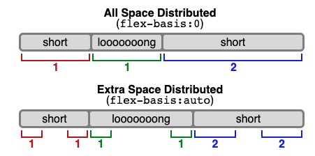
# flex-basis
defines the default size of an element before the remaining space is distributed. It can be a length (e.g. 20%, 5rem, etc.) or a keyword.
.item {
  flex-basis:  | auto; /* default auto */
}
# flex
This is the shorthand for flex-grow, flex-shrink and flex-basis combined
.item {
  flex: none | [ <'flex-grow'> <'flex-shrink'>? || <'flex-basis'> ]
}
It is recommended that you use this shorthand property
# align-self
This allows the default alignment (or the one specified by align-items) to be overridden for individual flex items.
.item {
  align-self: auto | flex-start | flex-end | center | baseline | stretch;
}
